A wonderful idea.
Simple delegation.
. . .
Do nada.
The Problem
How can entrepreneurs wearing too many hats find the expert freelancers necessary to launch their fledgling business? This is the problem that our startup client, Donada, sought to solve with a matchmaking service. The white-glove version of Fiverr.
Our client had asked us to turn this vision into a web-based user experience. My design mentor and I took this on as a team of two, and spent 2 months working on it together.
Before coming to my team, Donada had a black-and-white form for a website, and no UX specialists onboard. The company was armed only with a competent branding specialist, and a developer. My design mentor and I came on the scene to understand the vision, and design a beautiful user journey that would propel Donada to the next level.
Designing The Solution
Research
I first researched the big players in the freelancer world: Fiverr and Upwork, who are masters of streamlining the freelancer-entrepreneur relationship throughout a collaborative process. Then, I ventured to some other marketplace sites like Etsy that displayed products like we would display various services. I analyzed these and provided a Competitive Analysis sheet to our client, which fostered some insightful feedback and helped us align further.
The Solution
At the end of the research period, I realized that we had a few primary points of contact:
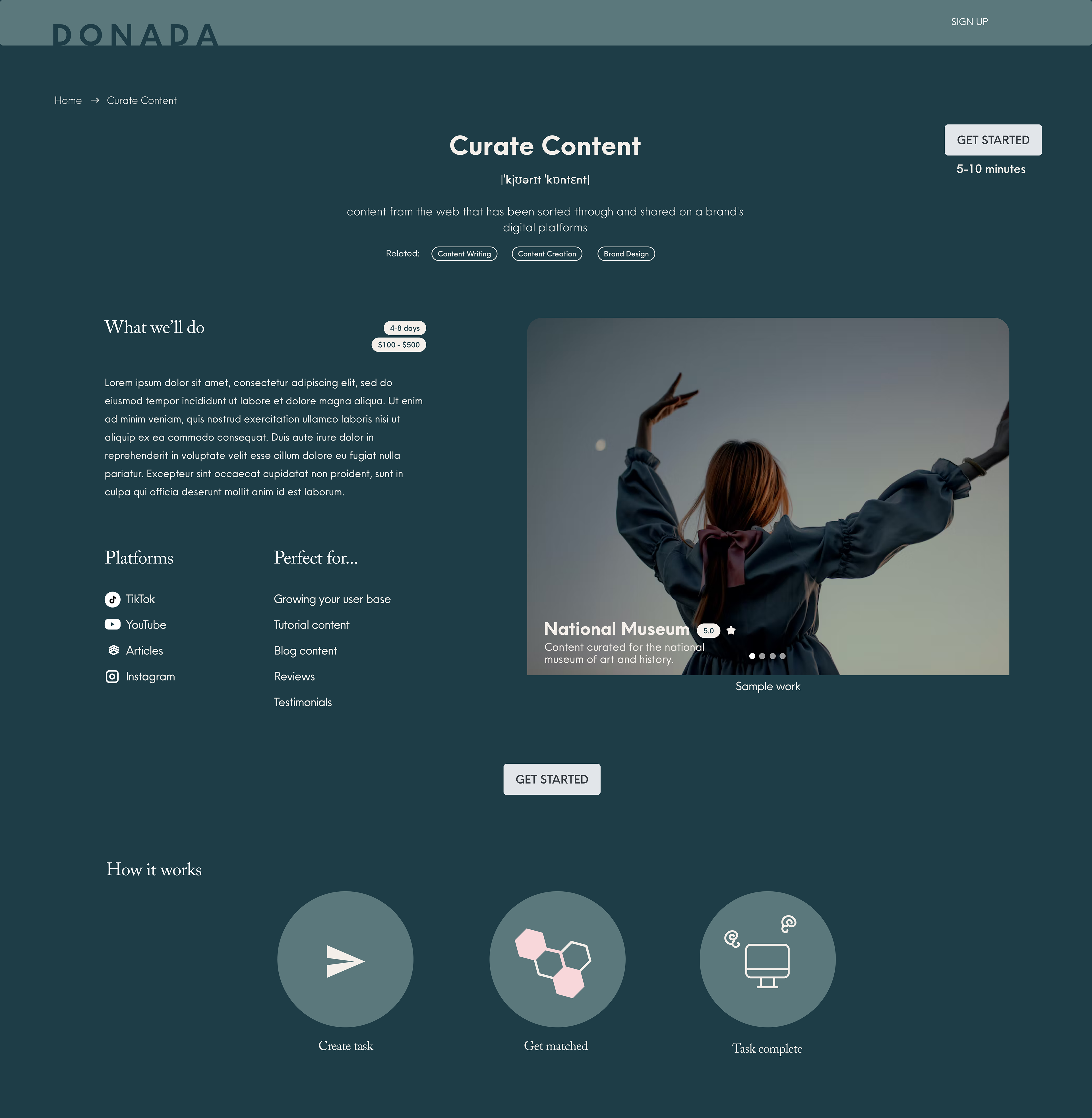
Point 1. Have the UI build trust with users, and encourage moving to the next step.
After a simple search bar interaction, users landed on a page describing the service. We built trust by utilizing reviews for social proof, setting cost and timeline expectations, and providing a clear overview of the matchmaking process.
Large calls-to-action prompt the user to "get started", and provide an estimate of how much time they'll commit.
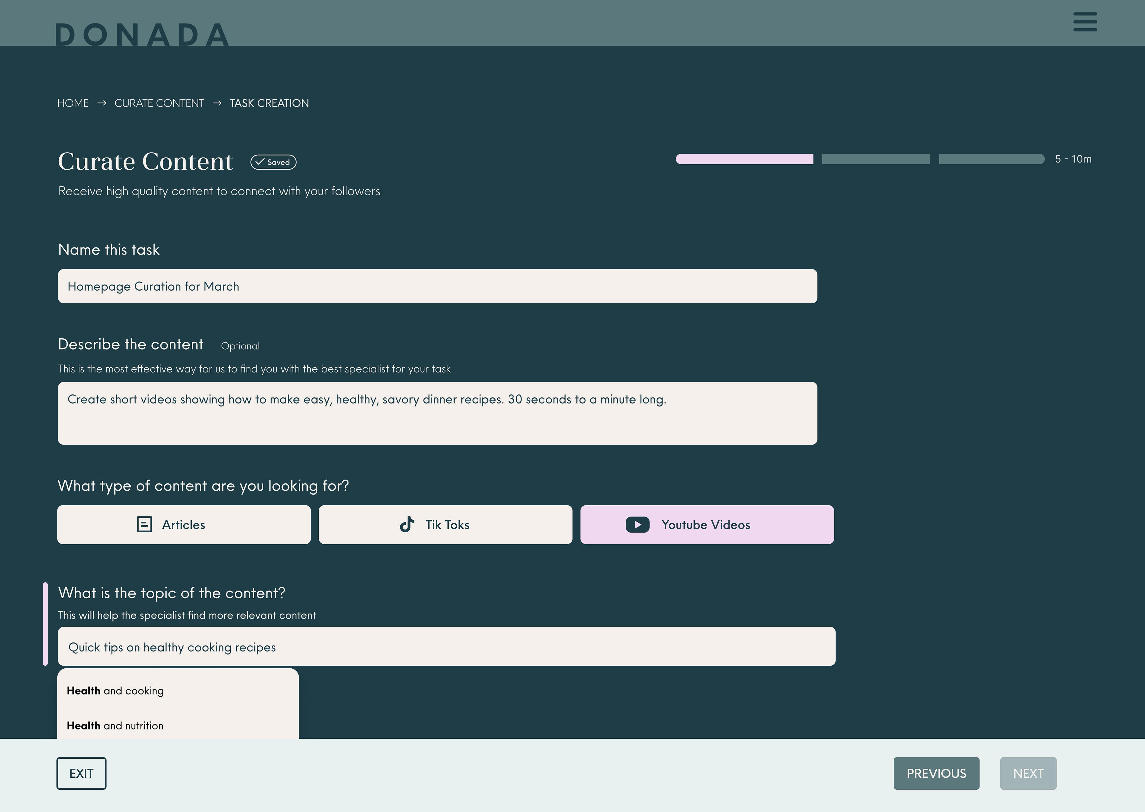
Point 2. Prompt our user to describe their project for our experts, and optimize matchmaking.
After choosing a service type, users needed to describe their project. In order to minimize cognitive strain and encourage users to give information they may not otherwise know is highly salient to the experts, we reduced this process to a series of short-answer and multiple-choice questions.
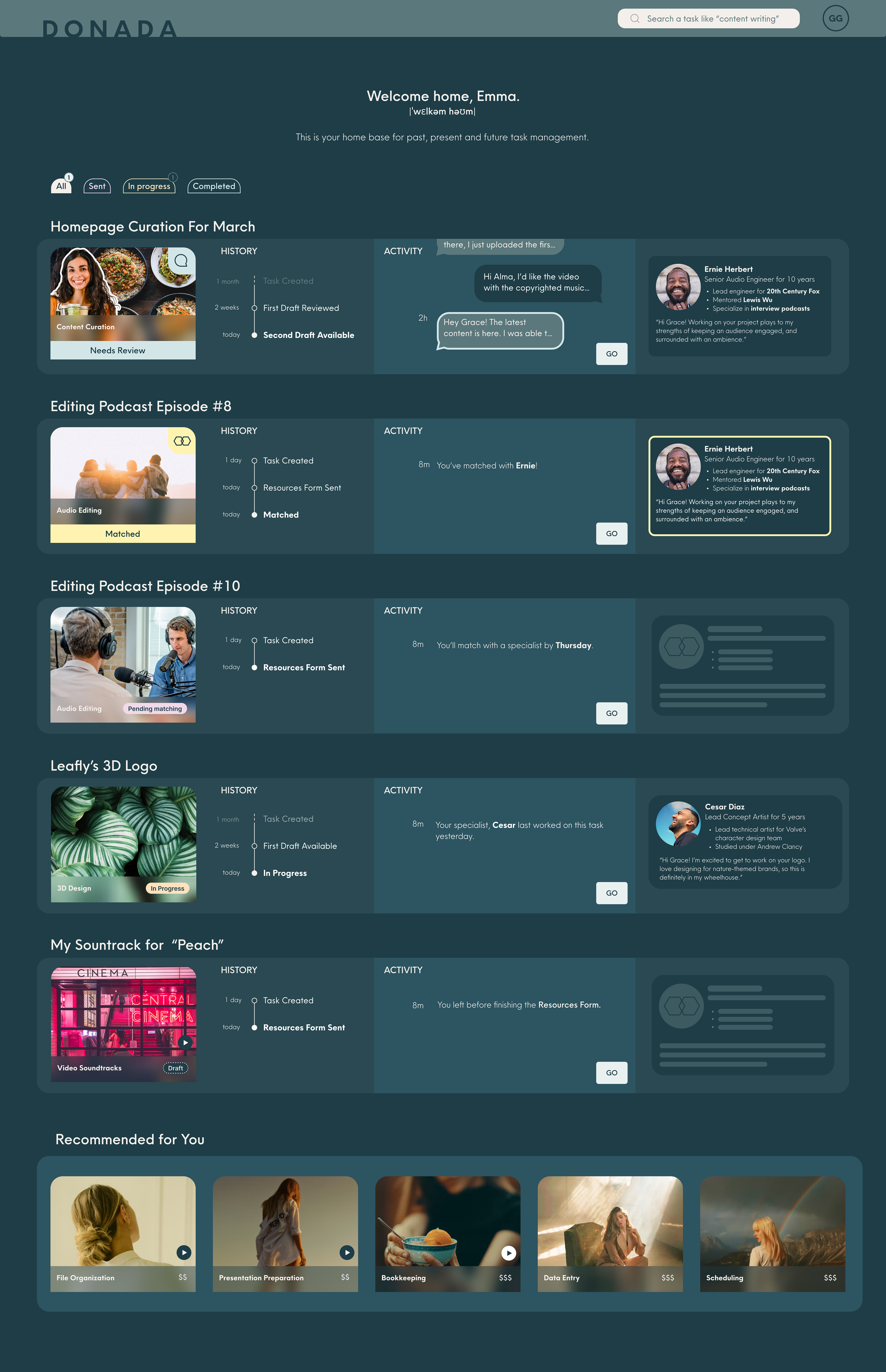
Point 3. Provide insight into their project's progress, from matchmaking, to feedback, to resolution!
This complex set of requirements called for nothing short of a dashboard. We navigated differentiating projects in every stage of the creation process: drafts, projects awaiting an expert, projects with an expert assigned, as well as those that were underway.
To complicate things further, we needed a way for feedback to be provided, and ideas to be communicated. Thus, the messaging feature was born, and integrated with the project timeline.
Lastly, we needed to double down on instilling trust in the expert that was matched to your project. To do this, we added a bio for the expert assigned to our user's project, complete with reviews and experience.
Learnings
After this project, I found myself looking more closely at how spatial relationship guides the eye on marketplace homepages. Etsy, and Airbnb are examples of the clean, elegant look I strive for. They manage to convey vast amounts of information in bite-sized chunks that feel anything but overwhelming. This project was a foray into this space, and I'm eager to deepen the insights I gleaned during the research and competitive analysis process.