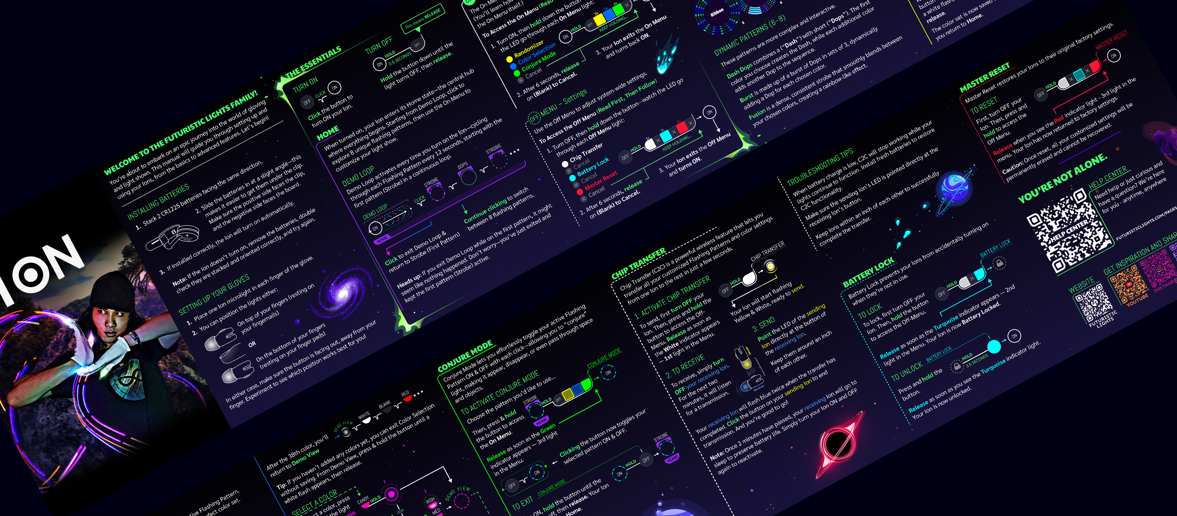
The Problem
Futuristic Lights' entry-level LED gloves are designed to be approachable for beginner flow artists, but a critical piece of the puzzle needed redesign: the manual.The product interface relied on a single LED and a single button to navigate through states and menus, the light used color changes and flashing to give feedback. This meant we had to find a way to represent these temporal journeys as visual, spatial instructions so beginners could walk through the timeline in advance.
Designing The Solution
Role and Team
I stepped in as a contract UX Designer and Researcher alongside the CEO/Founding Product Designer. Together we took on UX writing and design and research. After the core work was complete, I added the visual fit and finish.
Research
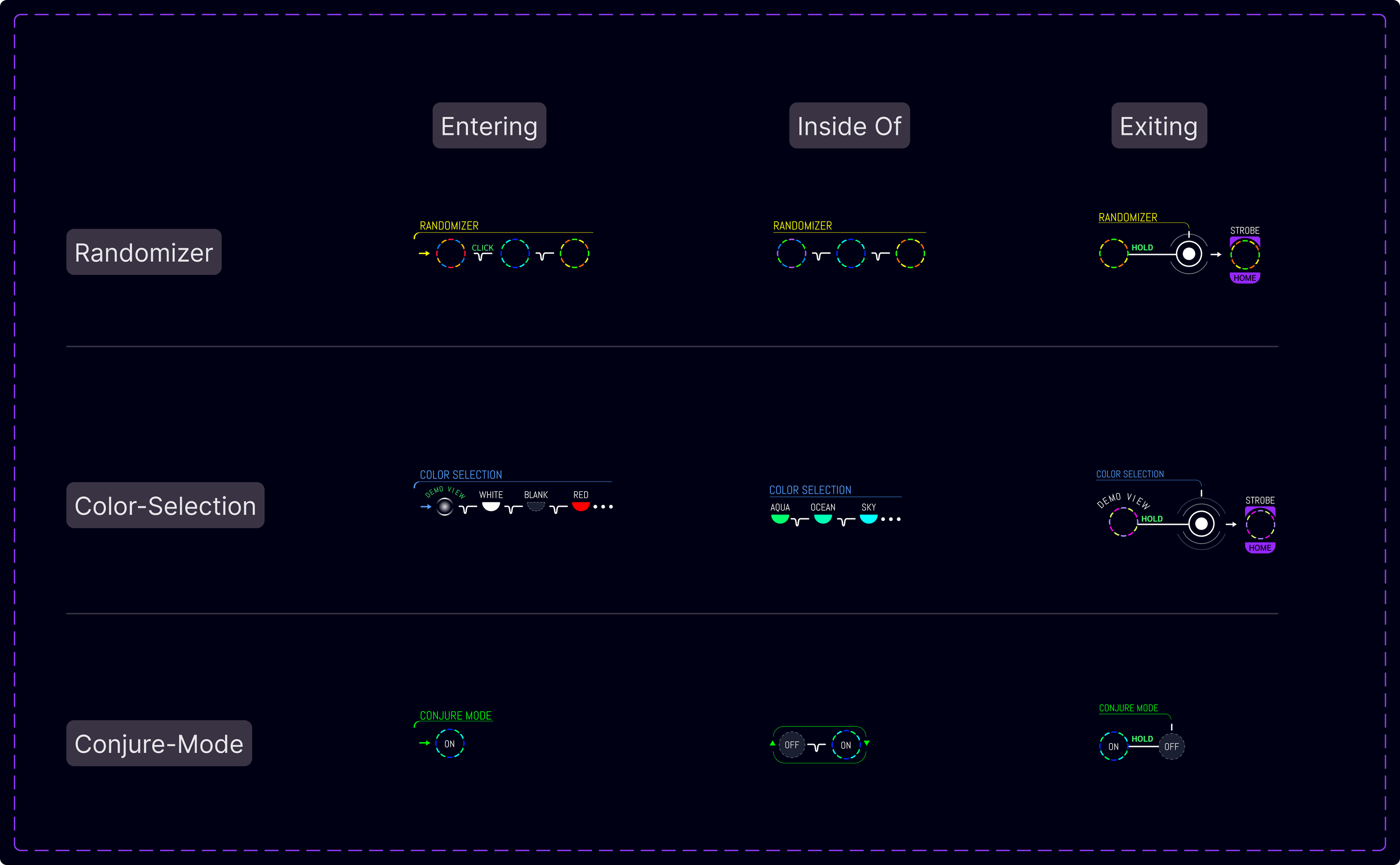
I interviewed the glove's inventor to learn about recurring user struggles. Immediately, we reframed the manual as an interactive map in print. This new concept launched me into a whirlwind of design systems ideation. I needed to represent states, cues, and actions, all the while ensuring the user was able to remain oriented.
We wanted every diagram to answer the three key navigation questions: where am I, what happens next, and how do I do it?
Writing documentation alongside building the system itself allowed icons to go into use as soon as they were built.
Design System
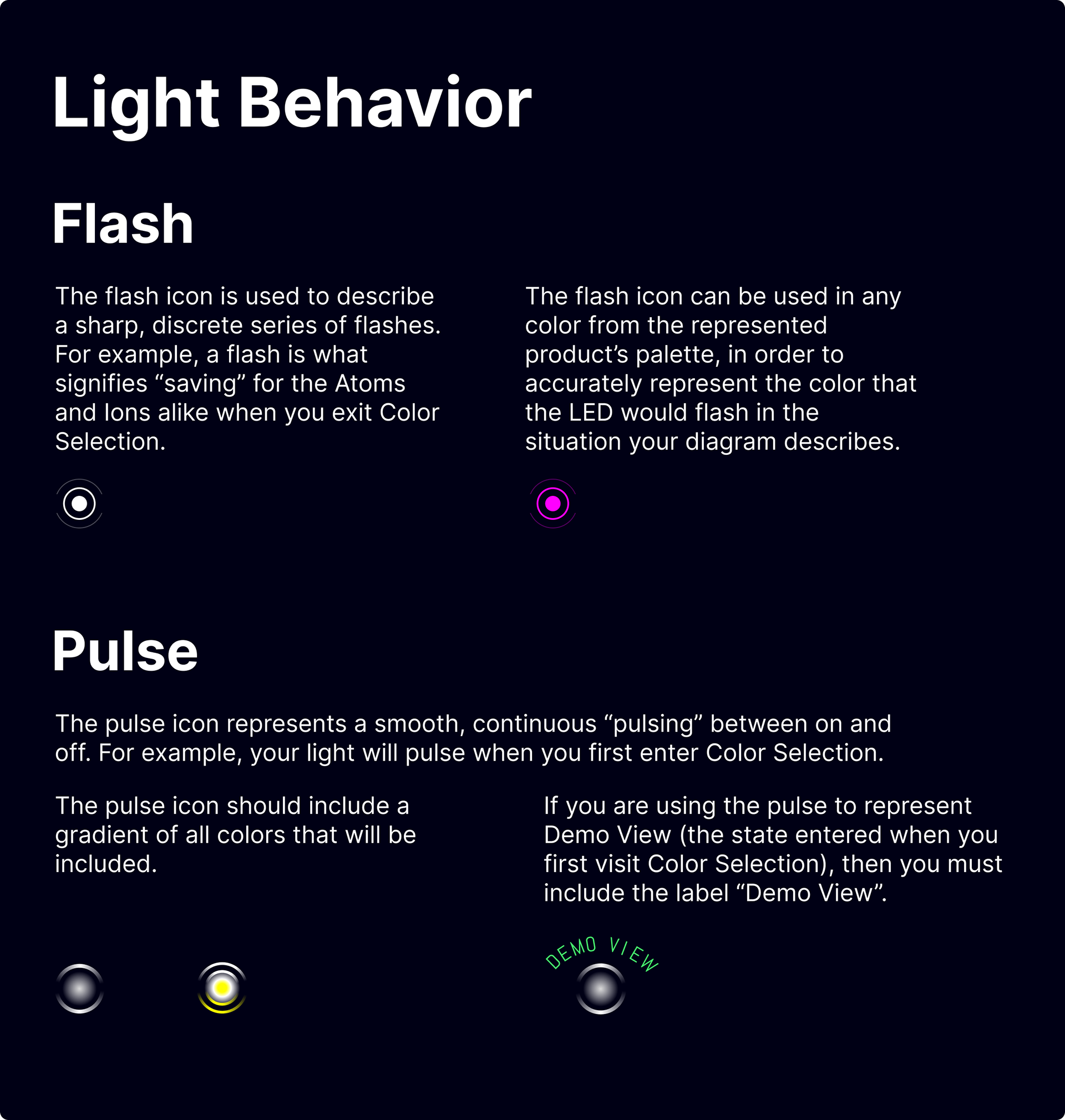
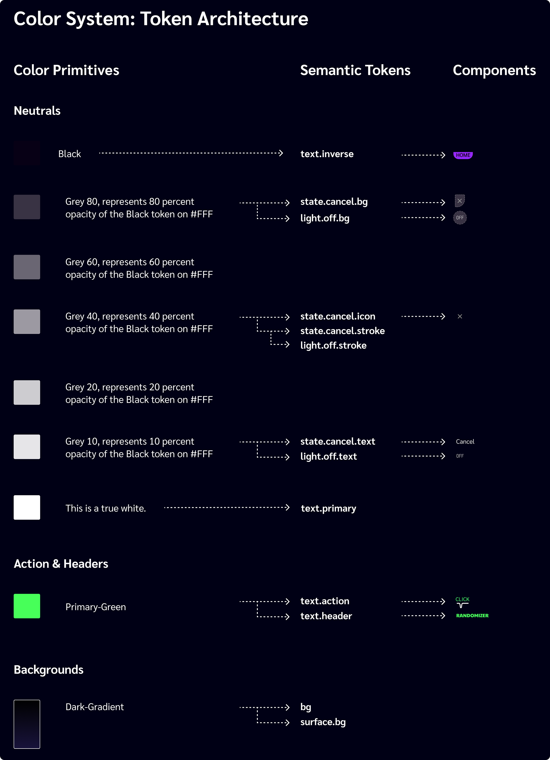
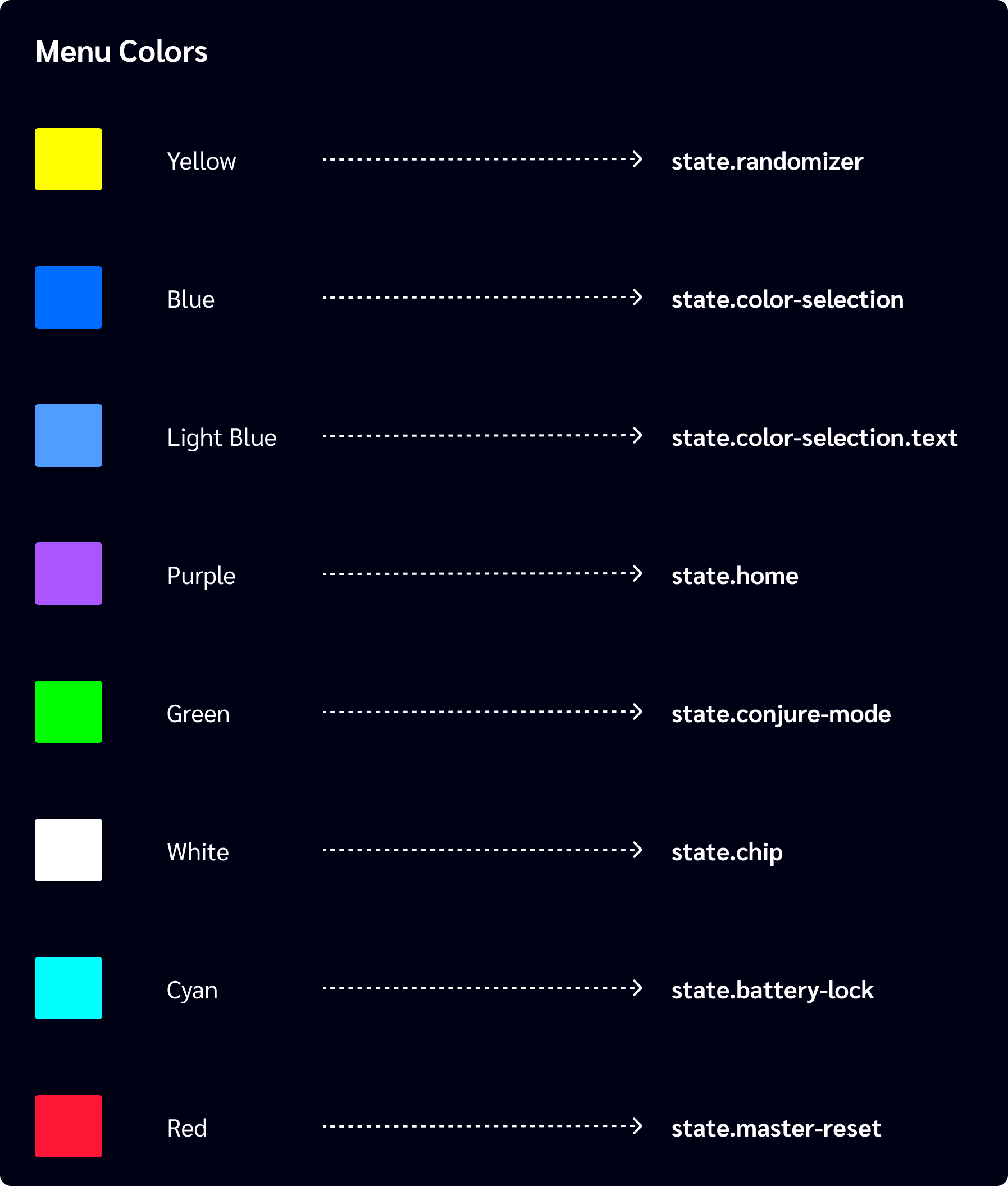
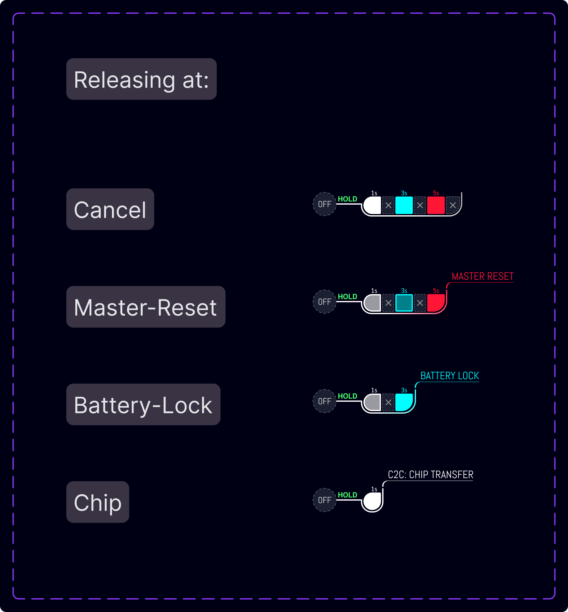
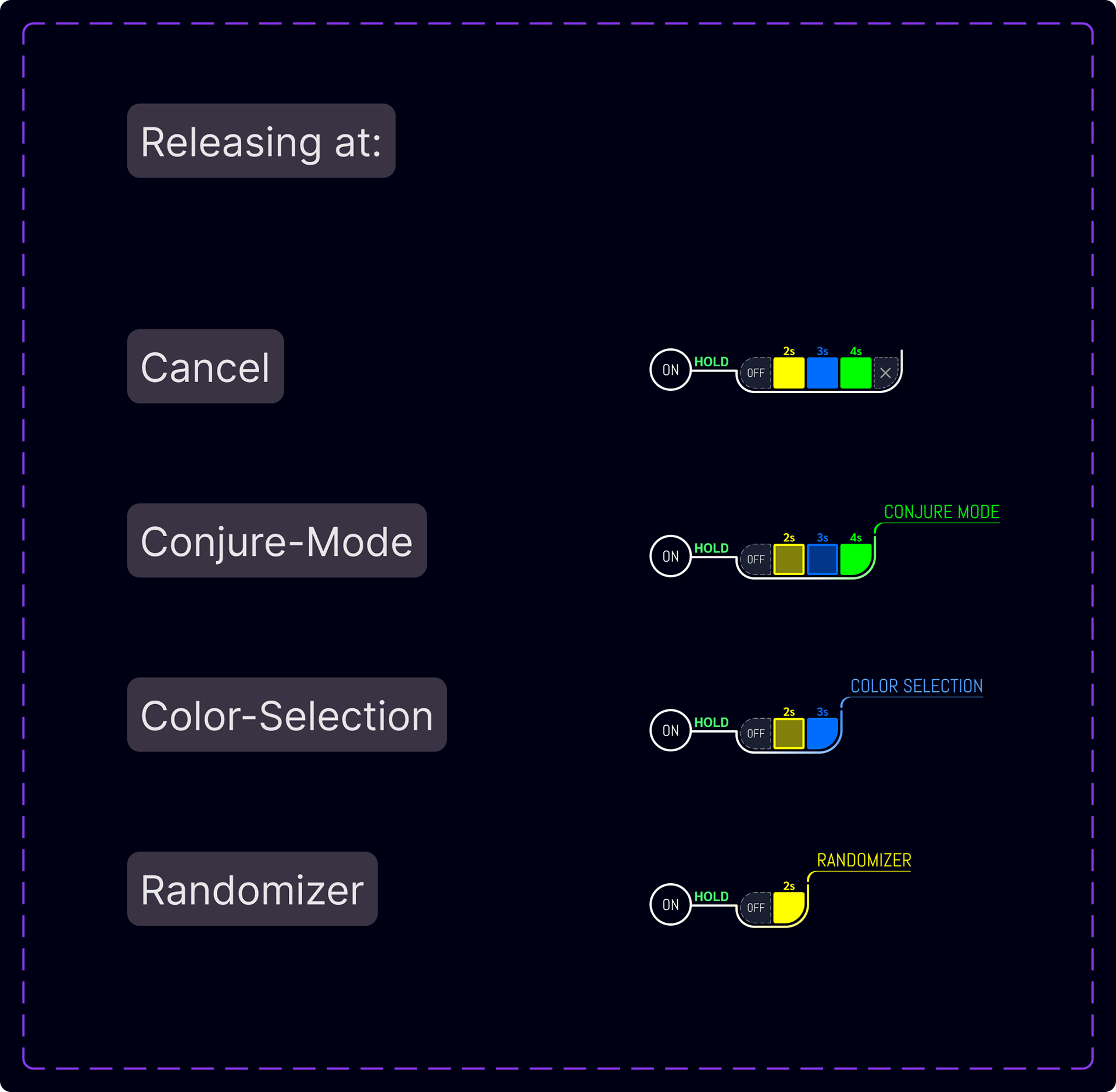
Task one? Develop a symbolic language. I built a modular set of icons to convey state, timing, actions, and light response.
Task two. Make the most of every line. Each line and curve is used to encode menu hierarchy, repeated steps, and section length. A three-weight type scale reinforces that sense of location, allowing for comprehension at a glance.
Task three. Make the most salient actions visible. The key user actions are highlighted throughout, giving an immediate answer to the question "what do I do next?".
Research Insights
After usability testing, we found that users were unaware that they had to wave the light back and forth to identify the flashing pattern. To resolve this we added verbal instructions and visual "sweep" icons that mirror the motion.
Users also hesitated when trying to recall which feature was in which menu. To address this we established a distinct split in visual language and menu naming.
Readers would sometimes accidentally enter a menu feature. We curbed their fear by introducing reference page numbers for each feature, giving them a place to go for answers.
Feedback
Before the next round, I had a few concerns to address:
Section hierarchy – The abstract overview of the menus shared equal visual weight with the menus’ feature pages, so users could easily breeze past these critical foundations of their nascent mental model.
Consolidate - With the symbolic language validated, we were ready to distill the information down to its final form factor.
Polish - Since I am the brand’s designer, it was time to add a dash of delight by illustrating more of the our galaxy.
Ongoing UI Audits
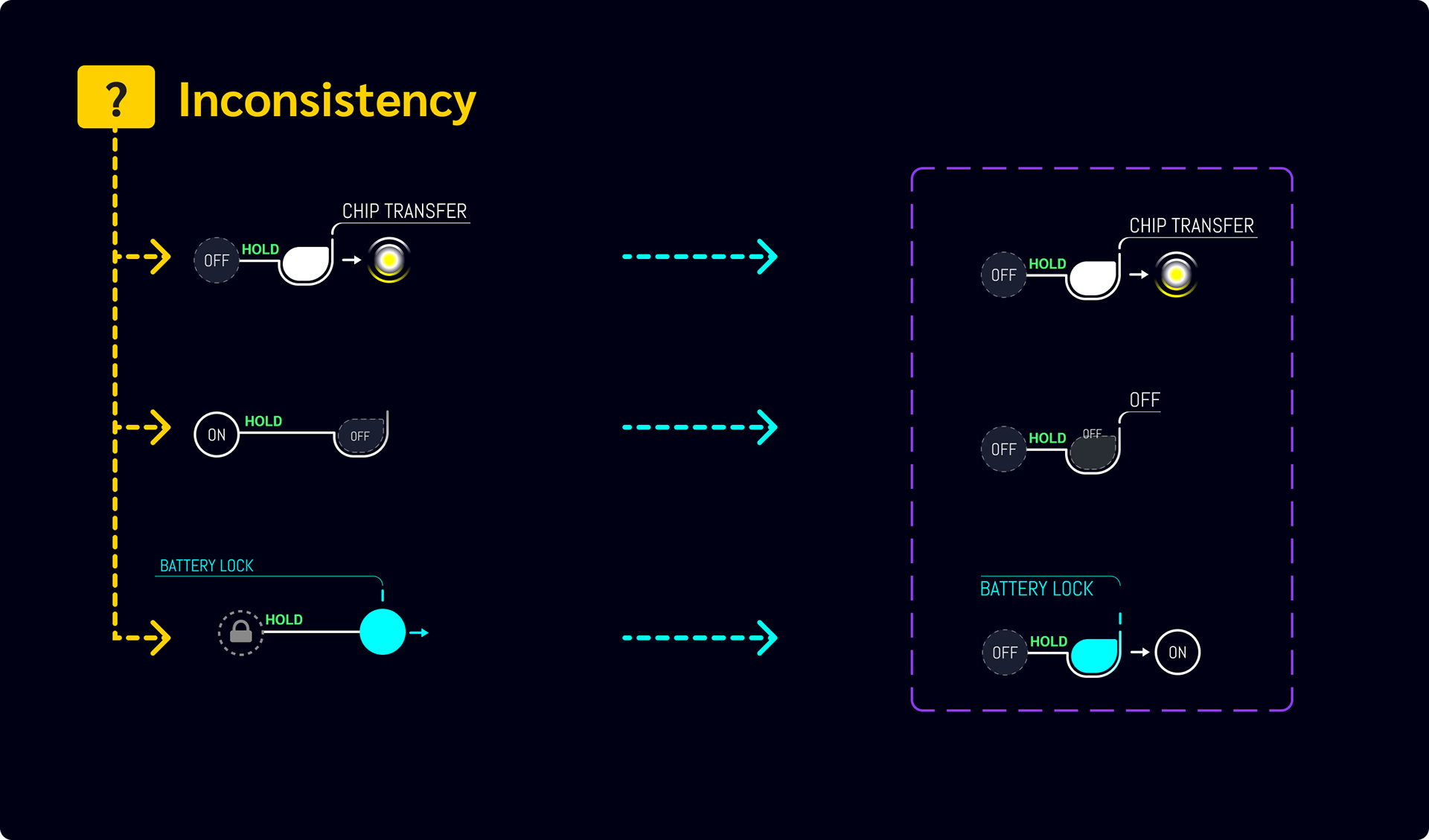
After observing the system in use, it came time to consider reevaluating whether our system is serving us as a team, and our users. I found some inconsistencies, which stemmed from diverse interpretations of components. I arrived at consensus with the team and updated the component library. We resolved future misunderstanding though clear usage guidelines in the documentation.
Outcome
We received overwhelmingly positive reviews for the manual. User confidence was high, even after a brief, self-directed read. There were frequent mentions of even the most complex sections being "very clear".
What I'd Do Today
With more time, I would use the symbolic system to create animated motion clips for the website, bridging the website-product experience.