The Company
Slumberfox was a customer-facing mattress review website. The mission of the company was to help overwhelmed customers in need of a mattress navigate the plethora of options at their disposal.
The Problem
Buying a mattress often comes with sorting through a lot of information, and infinite options. Usually the main source of information people take in, is marketing. This gives a one-sided, sugarcoated perspective. Not only that, but buying a mattress is usually an infrequent occasion, so usually people are not well-versed in the options available.
My Role
I started this venture with one other business partner, and took on all of the branding, visual, UI, and UX design.
Goals
Slumberfox needed a website, and we wanted to get it up and running in a month. We wanted to help users find the mattress that best suited their needs, and have a simple, playful brand.
The Process
Branding Beginnings
I also began work on the branding, which meant choosing whether we wanted a light or dark theme, and designing a logo. We wanted a space theme, to play off of the idea of nighttime and darkness. This led me toward blues and purples. Through experimentation, I ended up leaning toward a gradient, whether we ended up moving toward a light, or dark background for the pages.
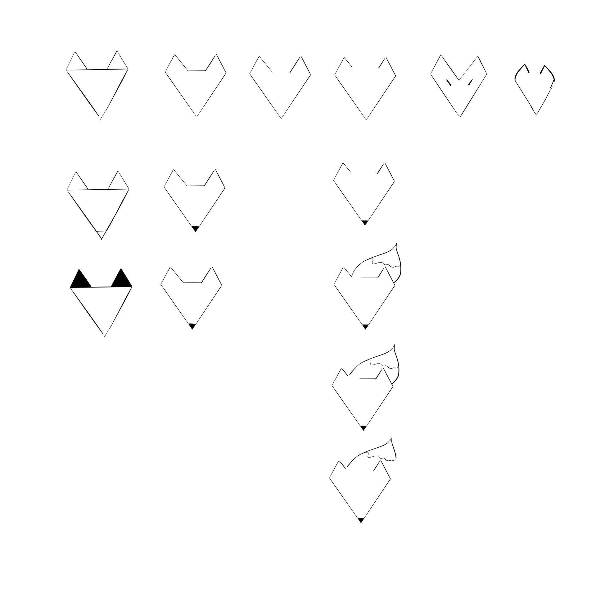
I wanted to have our logo be a fox, so that we had the opportunity to use him as a defining character in future illustrations and marketing.
Research and User Interviews
Through initial user interviews, I gathered that mattress customers were already well aware of what price range and firmness they were looking for. Later down the road, this information helped me narrow down the options in a way that was helpful.
As far as surveying the existing market, I took a look at several mattress review websites, but felt that I ultimately wanted to take things in a new direction and diverge from the standard layout.
Color Theme
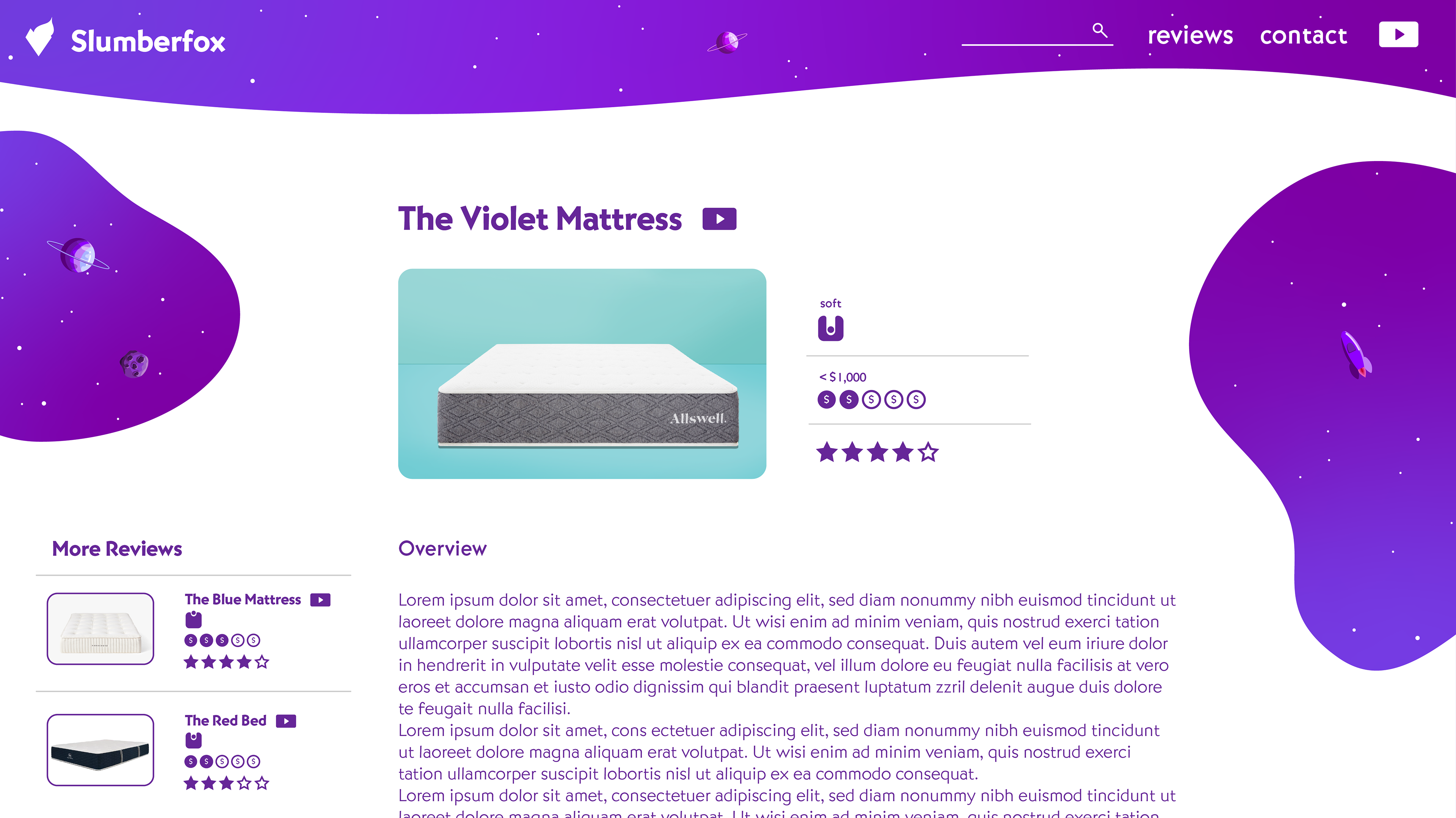
Since the primary function of this site was to provide users mattress reviews as blog articles, we settled on a light background for ease of reading. We also found that creating fully illustrated dark backgrounds was technically impossible. With that in mind, we decided to have a white background. However, we still wanted darker theme colors to appear over large areas of the site, especially given the space theme.
After much thought, I finally figured out how to have both at once. We could think of the background of the website as a wall between us and space. This spawned the idea of "windows" that could be cut into it, through which we could view space.
Functionally, these "windows" were just graphic elements that we could place anywhere on our website, allowing us to fill any negative space with a splash of color. This solution perfectly merged our need for a white background with our desire to have our space illustrations pervade every page and space on the site.
Sketches
After conducting interviews and gaining a holistic understanding of the user, I always take time to brainstorm a plethora of ideas. In this case, I did four sketches of each page: the homepage, the search page, and the review blog page.
The intention behind creating these sketches was to identify the most appealing layout elements through feedback. Later on, I use that information to create a cohesive, optimal design.
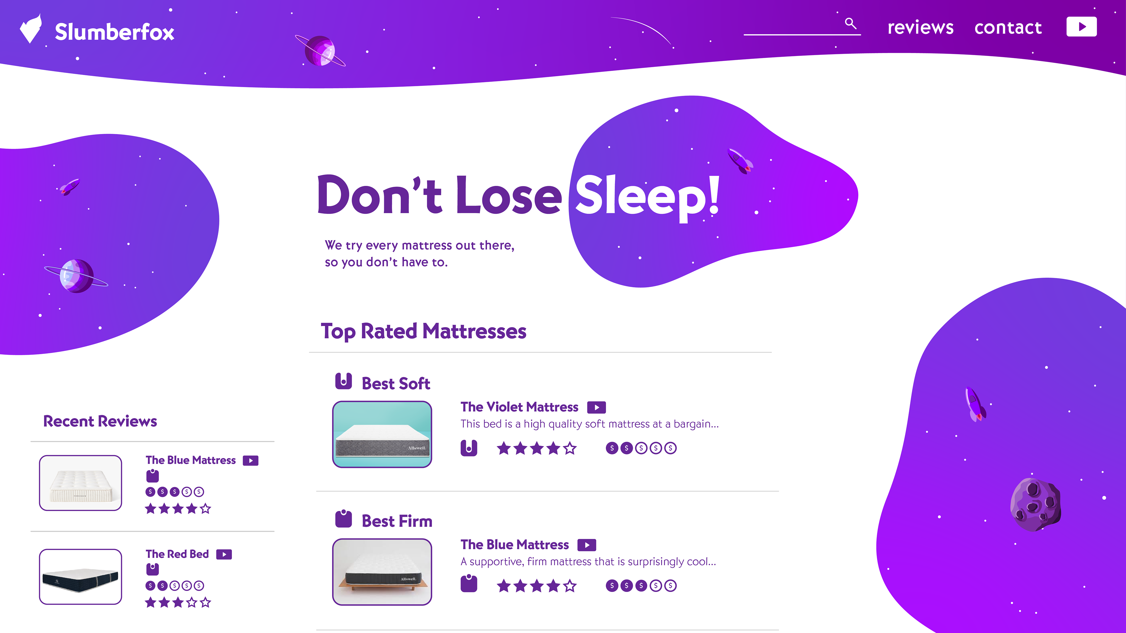
The user interview data came in handy when designing the homepage, as it led to the idea of creating a leaderboard of what we've rated the top mattresses from differing categories: soft, firm, and budget. This immediately shows the user narrowed options, and accommodates their priorities.


Initial Mockups
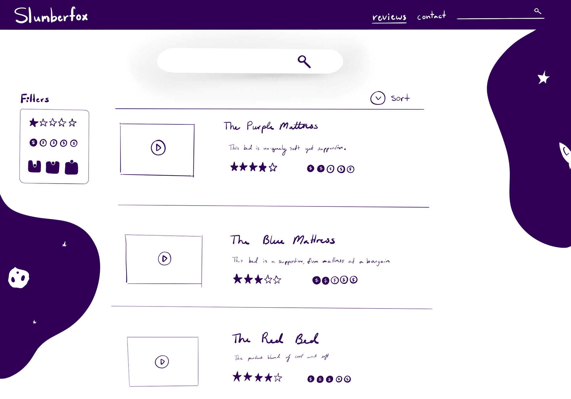
The three designs designs you see below were my response to the feedback I received from the black and white UI sketches. We were interested in choosing purple as one of our definitive brand colors, so I sketched these layouts in purple to allow us to better imagine what a final result could look like.
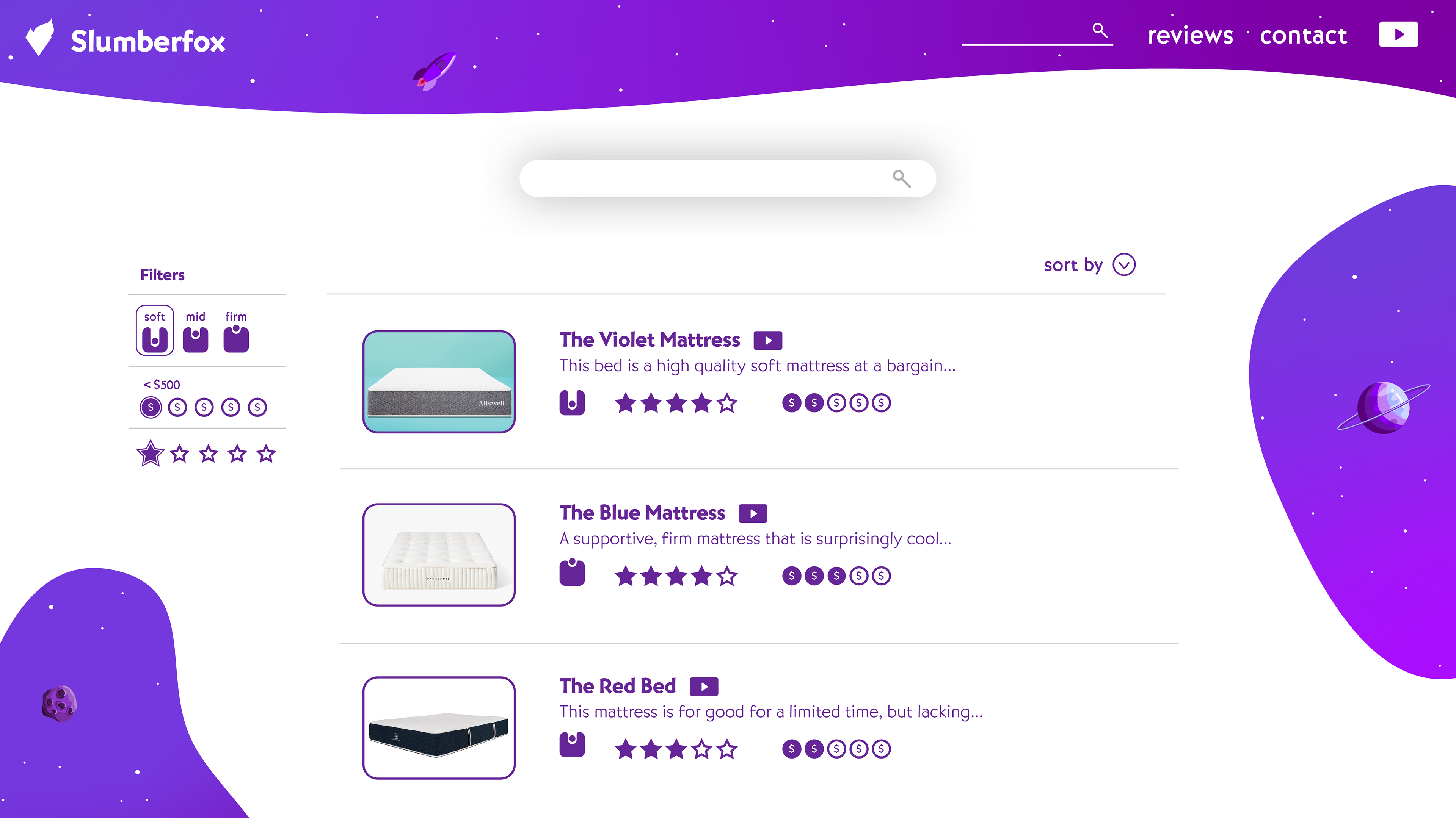
I also designed custom icons to communicate the three basic levels of softness: soft, mid-soft, and firm. These icons can be seen in the "Filters" box in the upper left mockup below. The icons resemble a head, or bowling ball, sinking into a mattress.


Feedback
The blog page design with the floating mattress seen above, on the upper right was a little inconvenient. The floating mattress effect would require someone to mask out the background out of every mattress we reviewed. This was certainly not ideal, and outweighed the benefits of maintaining our minimalist aesthetic.
In fact, including the background of mattress images could allow users to more easily recognize mattresses when searching across various websites, which could help users find our site after looking at the mattress elsewhere, or even help them find where to purchase the mattress after seeing our review, which are both immensely important.
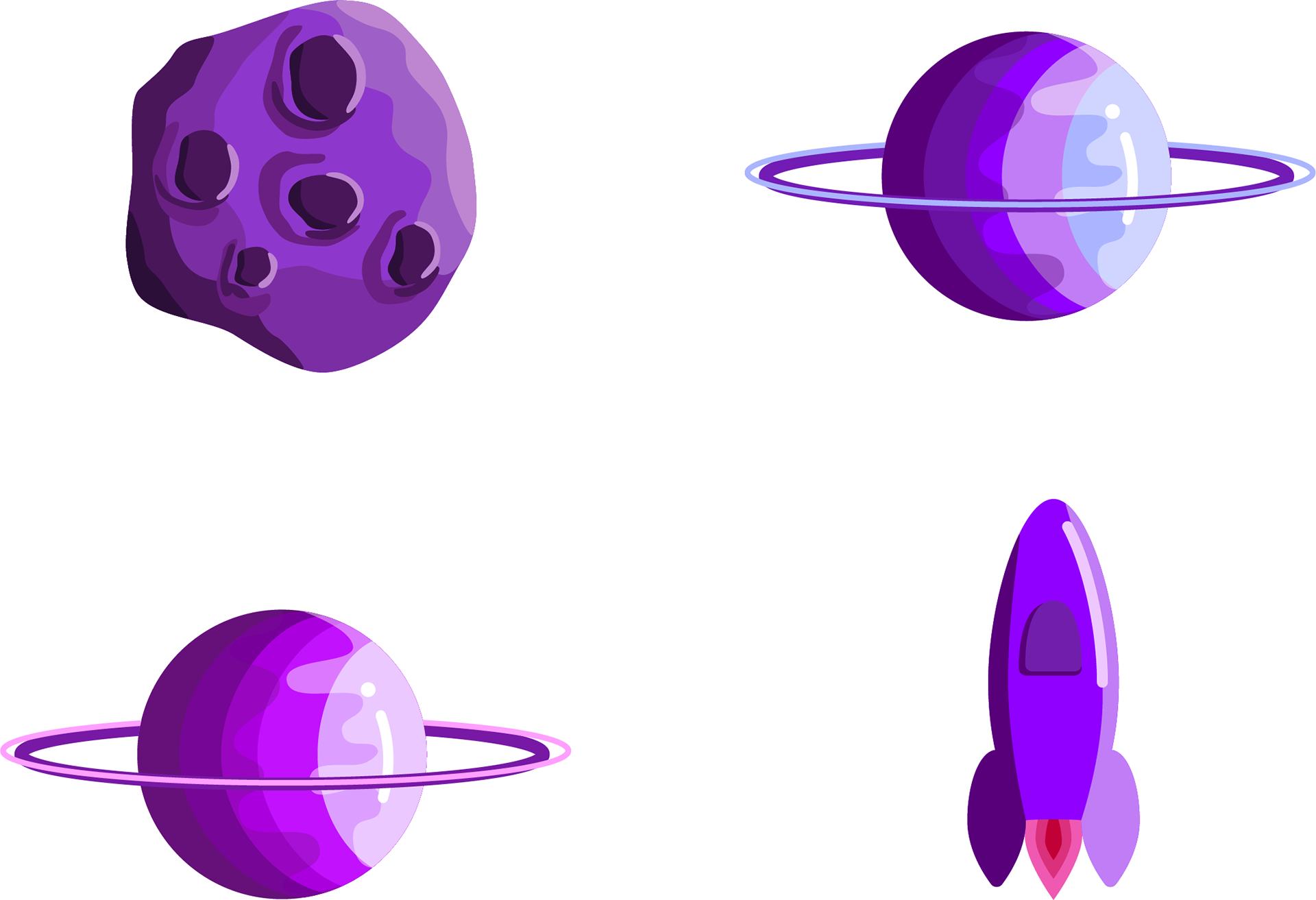
Branding Revisited
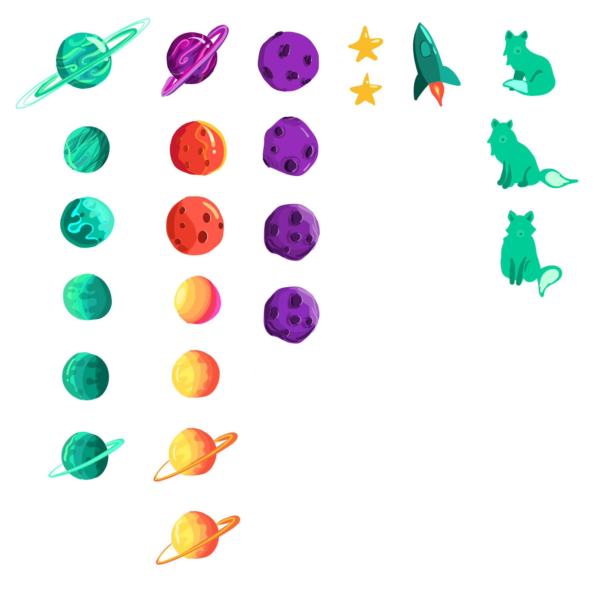
As you can see in the previous mockups, the space illustrations that define the brand also began to take shape. In order to move forward, I needed to develop an art style that suited the brand's personality, and use it to illustrate a moon, planet, and rocket.
Finalizing Branding
All that remained was choosing colors that would suit both the background of the website, text, and illustration elements like the moon, planet, and rocket.
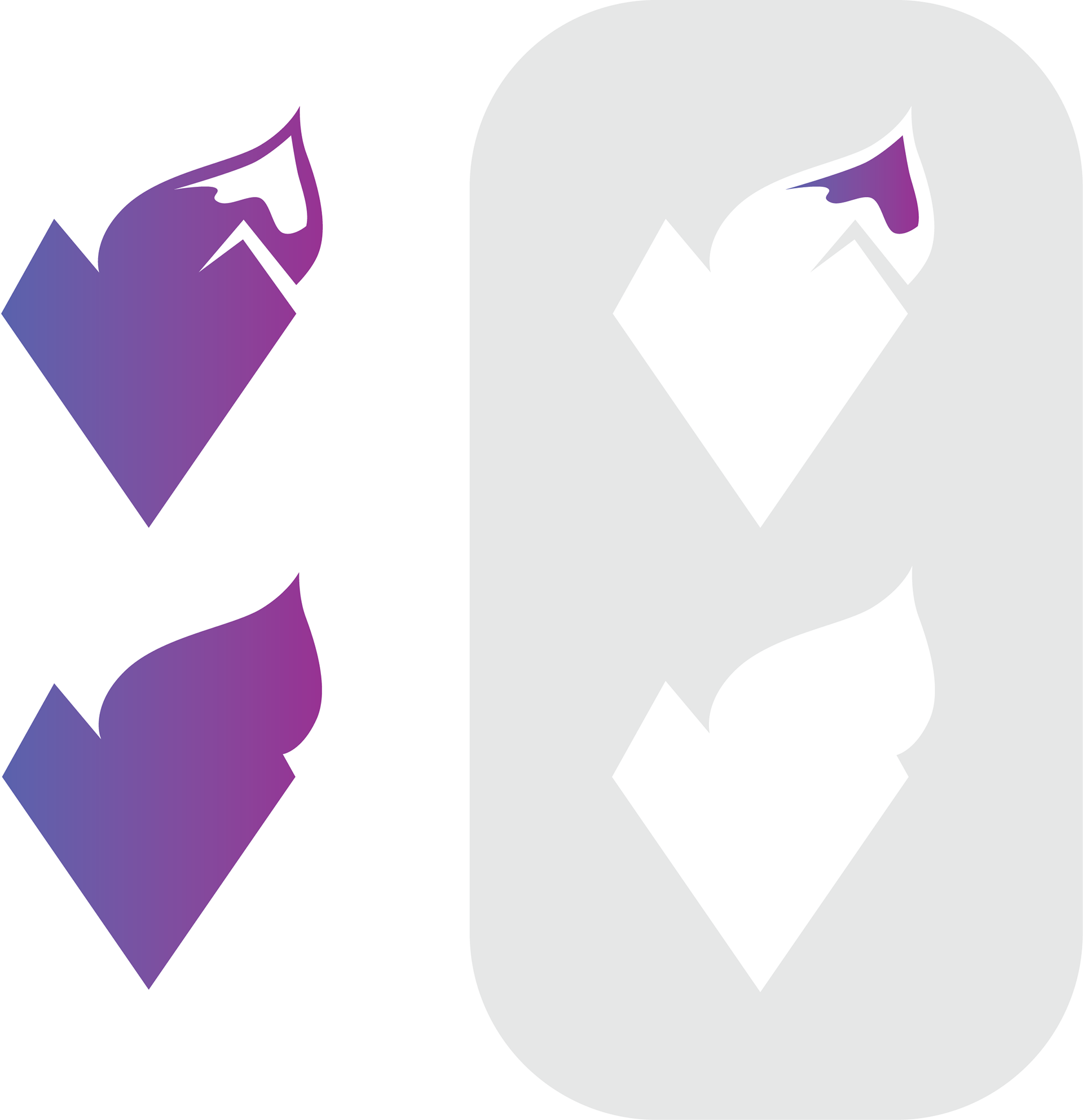
I also needed to finalize the logo, and create both light and dark logos.
Final Mockups
The final design can be seen below. I chose a punchy font to reflect the playful personality of the brand. This final design incorporates the branding illustrations, and immediately presents the user with a leaderboard of top rated mattresses separated by commonly sought out non-negotiable preferences.
Similarly, the search screen allows users to filter results by softness, rating, and price. Of these, softness and price were included specifically to address the needs of users I discovered during user interviews.